.webp)


.webp)
.svg)


One of the most critical parts of running a survey is reporting your analysis.
The way you present your findings makes all the difference in whether the results are understood, listened to, and acted on.
It’s so easy to make a survey analysis report boring and uninspiring. However, we can’t advocate enough that the best reports and presentations are fun and engaging as well as being clear and insightful.
So, in this article, we’re going to run through some of our favorite ways to present a survey analysis.
We cover some visualization techniques, including templates, and take a look at how you can turn your analysis findings into a fun quiz to engage your team in the results.
For this article, we've focused on the results of a recent CSAT survey analysis we completed. Let's start at the beginning by answering the question, what information do you need to report?

What Data Should be in Your Customer Satisfaction Survey Analysis Report?
As you know, customer satisfaction surveys typically ask the customer for two pieces of information:
- A rating
- A reason for that rating
Presenting the ratings themselves is often left to the simplicity of a bar chart, i.e. what percentage of our customers indicated they were satisfied.
The reason for that rating is more difficult to present and relies largely on the survey analysis you complete.
For our customers at SentiSum, we run automatic topic and survey sentiment analysis on the verbatim texts left in the CSAT surveys.
More advanced AI-driven analyses like these allow you to present much more meaningful insights from your survey, like exactly why customers are happy or unhappy and whether that’s changing over time.
When it comes to the question of what to present, we recommend taking some of the ideas from our ‘how to sell the value of CX internally’ guide.
The best bits of advice from the guide are:
- Include quantitative data—hard evidence is hard to ignore.
- Don’t forget the qualitative—we’re emotional beings and love a story. Qualitative feedback, like an example of verbatim feedback, really makes the point hit home.
- Know your audience—Be selective in what insights you present, the more relevant to the audience the better.
Here’s a survey analysis report example that includes a healthy mix of qualitative and quantitative data:

We chose a particularly impactful quote here, one where the customer says they’ll be cancelling their subscription because of the issue.
While not every customer complaint is that severe, this one is impactful and shows how important this issue can be it can directly influence business revenue growth.
Four Ways to Visualise Data in Your Survey Analysis Report (With Examples and Templates)
Here are four different ways to present your analysis. Let's start at the easiest.
1. Use Screenshots in Your Survey Reports
We often opt for screenshots when presenting our survey analysis results.
It makes sense to use the pretty visualization built into our feedback analytics tool and to add extra information that contextualizes what our audience can see for themselves.
As we did in the example above, a screenshot of your survey analysis tool can be an effective (and fast) way to convey the right information.
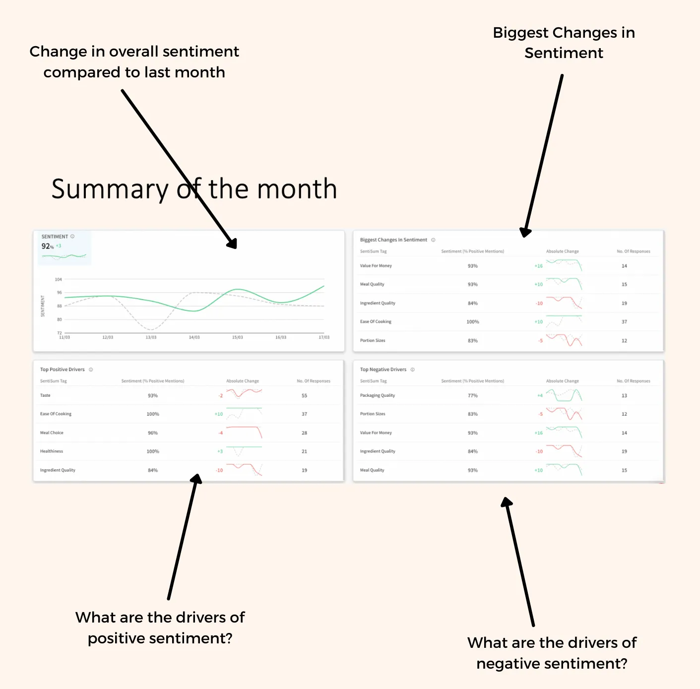
What you decide to screenshot depends entirely on the aim of the session and the audience.
Typically we find senior management want high-level information—to know the ship is sailing in the right direction—whereas, product or operations managers will want specific examples and granular topic data that’s more actionable for them in the short term.
2. Visualise Your Quantitative Analysis Using Excel Graphs [with three examples]
Excel is...just fine. Usually, I would steer clear of Excel to avoid flashbacks to my finance internship, but the data visualisation options are flexible and there’s lots of variety.
The way you present your data often matters more than what you present—you may inspire more ‘trust’ in your evidence if it’s packaged up nicely.
With that in mind, we’ve pulled together a few different Excel data visualisation templates to get you started.
If you’re using SentiSum, follow these steps (if you’re not, these graph templates are still a useful inspiration, you’ll just have to do a little more of the data manipulation work yourself.)
First, Export Your Data from Your Survey Analysis Tool
Step 1: Export the data you’d like to see visualised. In the template below we have one tab for exporting the ‘summary’ and one tab for exporting the ‘deep dive’ analytics.
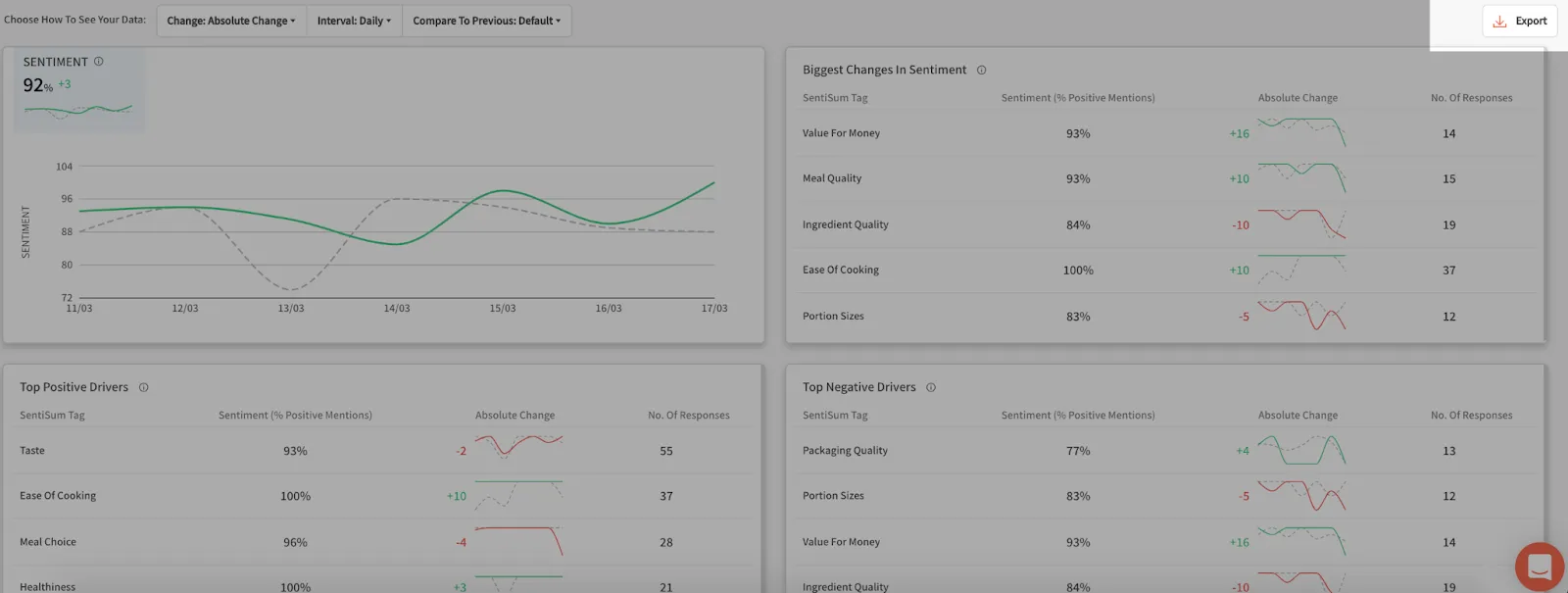
Step 2: Copy and paste it into our Excel template, which you can download below.

Step 3: Once you’ve done that, the graph visualisation on tab 3, 4 and 5 should be populated automatically (make sure you adjust where needed for extra data points).
Then Test Some of These Visualisations
Here are the three visualisations in the template:
Try Excel's Sunburst Chart to Present Your CSAT Results

I love this way of presenting CSAT survey themes and their corresponding quantitative sentiment score.
The Sunburst chart works particularly well due to its focus on hierarchy. The size of each wedge indicates the the volume or frequency that topic was mentioned in the CSAT results—the larger the wedge the more often that subject came up.
Key Resource: How to create a Sunburst chart.
Use Excel's Positive/ Negative Chart to Report Your CSAT Results
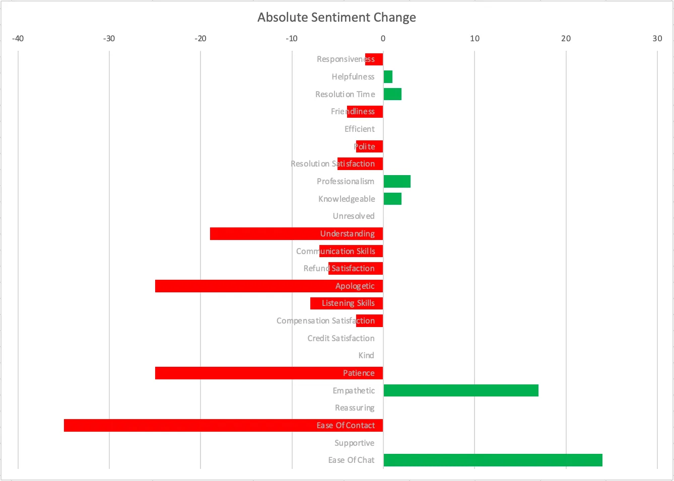
A positive/ negative chart is a really simple way of reporting customer sentiment change. The chart shows whether the sentiment for a topic went up (in green) or down (in red) relative to the previous period.
This gives your team a really quick snapshot of what's going on, and serves as a starting point for conversation. You're likely to be question a lot about what's caused the large swings in positive or negative sentiment, so be prepared with your root cause analyses.
Key Resource: How to create a positive/ negative bar chart.
Visualise Customer Sentiment with Excel's Thermometer Chart
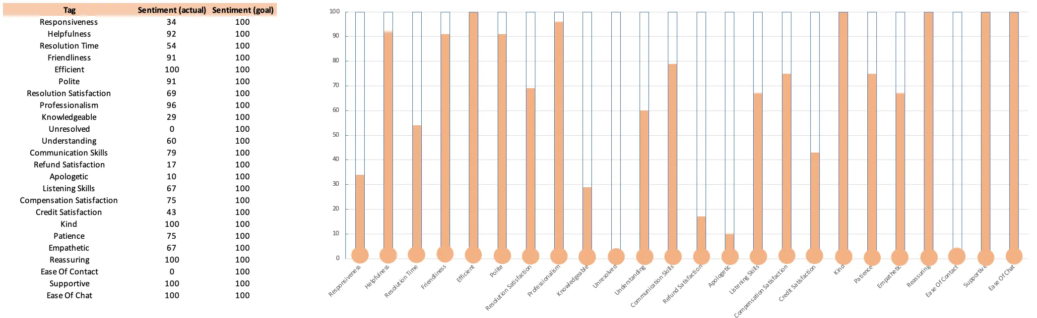
This is one of my favourite graphs to use (in part because it took so long to create).
When mentioned, each topic or theme is mentioned positively or negatively. The thermometer for that topic shows the percentage of mentions that are positive. In the example above, ‘responsiveness’ is only 35% positive and shows a nearly empty thermometer.
The thermometer graph is visual and sends a clear message that we want to be full up—100% positive is our aim.
Key Resource: How to create a thermometer graph.
3. Zoom in on a Topic with an Infographic
Tools like Canva and Venngage have a ton of different infographics you can use as templates in your survey analysis report.
Here’s one infographic created by Venngage for one of the surveys they did with their customers.

One of the benefits of using an infographic is that the results are easy to digest and easy to share—Not only is it more likely to be listened to internally, but your social media team will love you for the inspiration.
Find a ton of infographic ideas here on Canva and Venngage.
4. Combine It With Business Metric Data
Survey analysis data reporting gets really interesting when you link the survey results to revenue.
One method of doing so is to take a business KPI or metric that really matters to your business. This could be anything from NPS, cost to serve, lifetime value.
With varying levels of difficulty, you can the link CSAT score outcomes to that number and see if they correlate (i.e. Does a higher CSAT for a customer mean that on average they spend more or cost less?)
Let’s take a simplified approach as an example. In the Excel template included above, I’ve listed the Customer ID, the CSAT rating, and the # frequency of times they contact customer service. Here’s a screenshot:
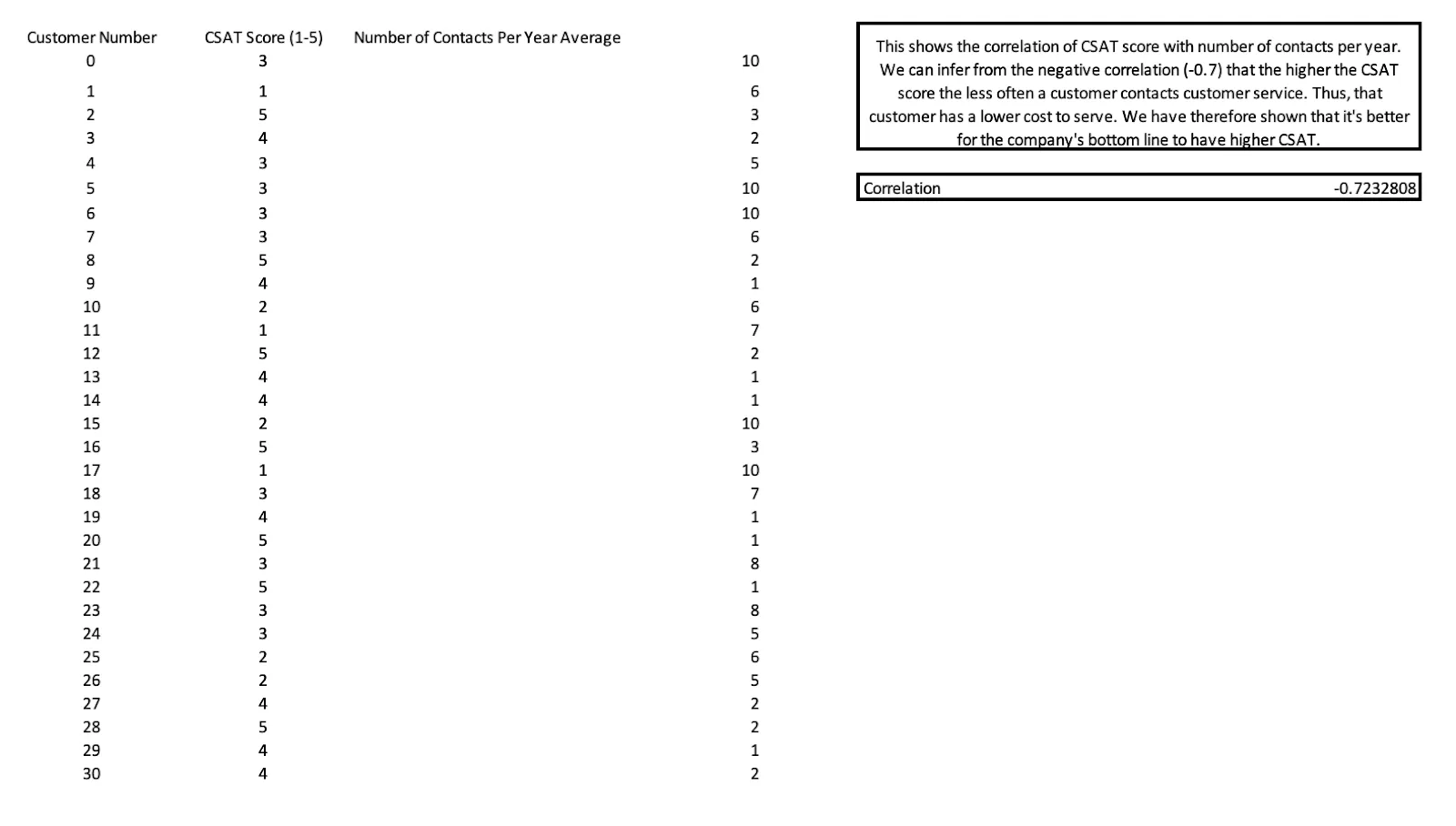
We know that customer contacts are costly to the business. They take agent resources and all the related overhead costs. So it’s safe to assume that, in general, more customer contact = bad for business (ignore for a minute whether it’s a positive or negative interaction).
By applying a simple correlation function in Excel, we discover a negative correlation between CSAT score and number of contacts. How should we interpret that?
Here’s one interpretation: All things being equal, the higher the customer satisfaction the less often they contact customer service.
Isn’t that a powerful statement to report internally?
I strongly suggest roping in your data analytics team to help you with linking CSAT, NPS or other customer scores to revenue, because I oversimplified the calculations here to illustrate what could be possible.
When done right, linking CX outcomes to ROI is a powerfully important project that will give crucial weight to greater investment in CX projects.
Another Fun Way to Engage Your Team on VOC Data—A Quiz!
When I first heard this idea I knew I had just been told something special.
I was mid-episode recording with Svitlana Gaunt, customer experience operations lead at Otrium, discussing how her team successfully changed BPO during the pandemic.
Svitlana let me into the secret behind how her CX team engages teams across her business as they scale up, and encourages customer centric thinking despite the rapid growth trajectory of the business.
How do they do it? A quiz!
I think this is a great way to make CX fun, engaging and actually listened to through the business.
Svitlana kindly shared some of the questions she includes in the quiz, and I’ve adapted and added some questions to make them even more relevant to survey analysis reporting.
The Customer Obsession Quiz
Here’s a 10-question quiz that you can use to share your survey insights and encourage others to listen and act upon your findings.
1. Which one is used the most?
- Our mobile application
- Our website
2. Which of these brands is the highest rated on TrustPilot and Google?
- Competitor 1
- Competitor 2
- SentiSum
- Competitor 3
3. What is SentiSum's current contact rate?
- 7%
- 10%
- 13%
- 16%
4. What is our largest contract size? (Or largest purchase?)
- £10
- £100
- £5000
- £1m
5. The search bar is used the most for which purpose ?
- To find insights
- To find customers
- To find categories
6. What is our average CSAT score this month?
- 3.5
- 4.9
- 1.6
- 2.3
7. Which of these topic is most mentioned by customers in CSAT surveys?
- Knowledgable
- Kindess
- Rude
- Easy
8. What topic saw the biggest increase in mentions this month?
- Payment Process
- Damaged Product
- Late Delivery
- Missing Item
9. Which of these features is most requested by customers?
- In-app support
- International shipping
- Web app
- Auto-refunds
10. Which topic drives the most of our customer contacts?
- #1 driver
- #2 driver
- #3 driver
- #4 driver
Adapt this quiz to your customers and the KPIs you track, and do the quiz in your next big company meeting. You’ll be surprised at how insightful the answer can be for those who aren’t on the frontline talking to customers each day.
Here are three tips for getting the quiz right:
- Try not call anyone or any team out in front of everyone. Public shaming is never motivating.
- Aim to share frontline knowledge with the rest of the business. Show off your knowledge of the customer and their needs.
- Look for the most insightful or surprising data points—things that make people go ‘aha!’ or ‘ooo interesting’.
Conclusion
How you report your survey or voice of customer analysis is an oft-sidelined part of the process, but it’s critical to get right.
Well-presented data can inspire customer-centric thinking and faster action. You should spend a good proportion of your time in the interpretation, design and presentation stage of analysis, and to the best of your ability make your results fun and engaging.
Heading 1
Heading 2
Heading 3
Heading 4
Heading 5
Heading 6
Lorem ipsum dolor sit amet, consectetur adipiscing elit, sed do eiusmod tempor incididunt ut labore et dolore magna aliqua. Ut enim ad minim veniam, quis nostrud exercitation ullamco laboris nisi ut aliquip ex ea commodo consequat. Duis aute irure dolor in reprehenderit in voluptate velit esse cillum dolore eu fugiat nulla pariatur.
Block quote
Ordered list
- Item 1
- Item 2
- Item 3
Unordered list
- Item A
- Item B
- Item C
Bold text
Emphasis
Superscript
Subscript